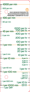
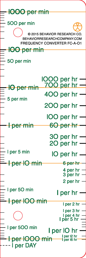
Our new Frequency Converter (FC-A-01) is now available! Please look at some charts for examples of how it can be used by complete charting novices to consume charted data….
Colloquially, we’ve been known to call it a “Chart ‘Splainer!” This is an indispensable tool for talking quickly about frequencies to varied audiences. We’ve seen people who have only pretended to be curious about data on a Standard Celeration Chart suddenly grab a Frequency Converter with a chart and start investigating all the little dots by themselves!
When precision teachers communicate frequencies to people, they often use arcane measures to which most folks can’t relate. Whether you are discussing a frequency of 0.021-per-minute, or a frequency of one-per-47-minutes, you may have lost your audience just by trying to involve them! Many of us know what certain frequencies “feel like” when expressed as “per-minute,” but for most folk, “per-minute” is only relate-able for particular behaviors or ranges. For many folks, the most familiar frequency for most ranges is “per-hour.” And this is a range they can “feel” when you talk about frequencies, particularly lower-rate behaviors.
Additionally, no fraction of a behavior has ever been observed! If you make the mistake of talking about behavior as fewer than one-per-minute by using decimals, then you are only that much more confusing! A Frequency Converter can help you “ballpark” frequencies so that you, and regular folk, can both get a feel for what is happening….
Check out the following example.
This has time samples of anywhere from four-and-a-half-hour days to eight-hour days. The lowest frequency on this chart is about 0.04 per minute. The highest frequency is 0.3 per minute. It looks like the ×1.5 trend is wonderful, right? But is it? And how can we best communicate these data?

Enter the Frequency Converter! Looking at the hour conversion side, we can easily talk about the range of behavior in the first week:
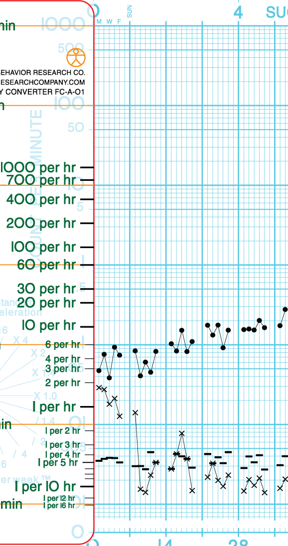
Using the Frequency Converter, we can easily and quickly show that the behavior occurred somewhere between a little more than twice per hour and six times per hour during that first week. Better yet, with a Frequency Converter, a novice can make that observation themselves! Note that you can also easily eyeball the timing duration of the record floor (the — marks near the bottom of the chart); in the first week the timing periods were all between 5 hours and 4 hours.
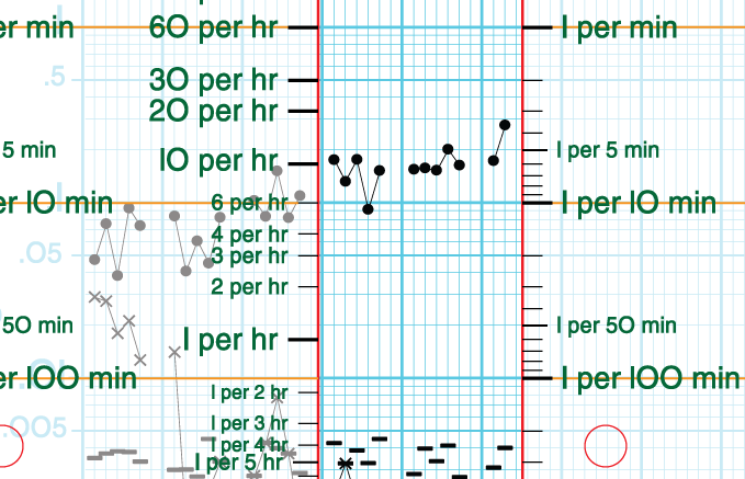
Line up the Frequency Converter on the left edge, and we can tell the story in a different way:

With this perspective, looking at the red arrows from left-to-right, it is easy to see that the first day’s data represents the target behavior occurring about once every 20 minutes. The lowest frequency is about once every 25 minutes. The highest frequency in that first week looks to be about once every 11 minutes! As with the earlier demonstration, a novice can use the Frequency Converter without much coaching at all. Gone are the days of novice data consumers trying to make sense of the SCC blue lines when looking at data (a recipe for disaster); the Frequency Converter lines are all that they need when looking at charted data. And it relieves them of the burden of scanning back and forth to the axis labels!
Here is a subtle point to be made when exploring “lower frequency” behaviors. It is sometimes very hard to know when data are in desirable ranges. Most of us can be blinded by high celeration values and massive change. Most SCC users are not fluent with how performances might “look” or “feel” in the bottom three cycles of an SCC. Let’s look at the data for (hypothetical) D.I. in the fourth-to-sixth weeks with a Frequency Converter:
These kinds of targets can be very elusive with regard to the sometimes narrow frequency bands within which repertoires appear competent and desirable. Too infrequent? Undesirable. Too frequent? Undesirable.
Thinking about at these data, consider that infrequent desirable behaviors (the three per hour in this example) can seem less than competent, yet eight per hour or 19 per hour might be incredibly annoying! Contingencies implemented in order to bring behavior into competent ranges can often slip outside of those ranges if the contingencies aren’t adjusted to control for both low frequencies and high frequencies. The Frequency Converter helps guide a thoughtful programmer to identify those ideal ranges.
With a Frequency Converter, it may be easier for people to “think” about frequencies with denominators that are more appealing to them. Some folks like “per hour,” some folks like “1 per,” and some folks like, “per minute.” Now you can have all three at your fingertips!